Fire logo project draft

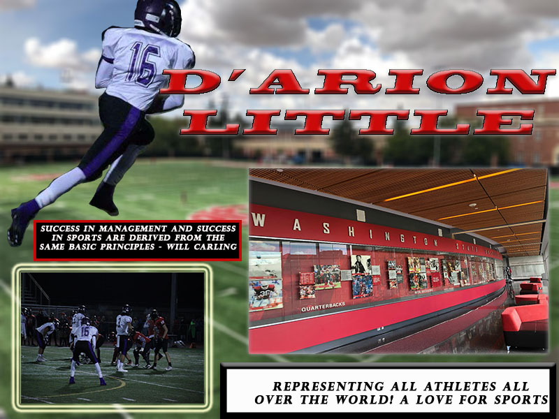
For this project I decided to make a logo that relates to my current topic which is on my major. In addition, I made it to where the marathon flag represents the overall idea of sports and how continuum the events are.  However, some designs designs that influenced me was nipsey’s hussles marathon campaign around his music. Signifying the fact that the marathon will always continue for the black community, kind of like a race in a way. Furthermore, i’d say the significant part about my design is the enlargement of the letter C abbreviating the word continue and the dash line across the top of the C to let it be known that this a long lasting continuing process. 

Apart from this, I’d say the design process was for me was at first a little  complicated because honestly i had no intentions on a design and i didnt know where to start. However, while drafting through my sketches I was thinking, what is something that sports can stick to, the idea of a marathon race stuck to me. The idea that sports will always continue, similar to a marathon race. And then boom that’s when my drafting got better so i decided to make SP, short for sports replacing the P with a marathon flag to emphasize the message. Moving forward, ways i used the elements on my design were easy, learning from what the illustrator tutorials had taught me on creating flag banners i utilize that skill to create banner. Then, I provided simple text from the fonts and I enlarge the letter C emphasizing the word continued in abbreviation; and lastly I wrapped up the logo making little line segments above the letters to indicate the long lasting process of sports in the sports field.

In addition, some of the tools and techniques I used were the line segment tool to create the hyphen mark above the C. than I used what I learn from the last tutorials to create the banner using the rectangular grid segment. However, some technical challenges faced while using illustrator was coming up with the marathon banner. I knew about the information on how to make banners based off the last tutorials but it was challenging trying to find a solution to make each square work like checkers. So while addressing the issue I did a little research on youtube about ways to successfully create the checkers banner; and I applied what I learned from that video and used that to create the effects of the banner.

Final imagery of graphic design project

with the feedback given and heard some of the changes I made to this project is the color scheme of each of my borders. However i loved the feedback I received from my group members and class peers. In addition, another thing I changed when going to my project was the widespread of my football cut-out, moving it down a little so it won’t take effect away from the title. Also, another thing suggested by my classmates was shortin the captions more and making them more of a pop-out theme.however, i did not make sufficient changes in shorting the captions but i did make each of the text the same font. More importantly, one thing i personally fixed and noticed myself when doing my revisions was adjusting the text borders so they all line up in correct format evenly; as well as keeping all the font themes the same. To wrap things here i believe the minor changes here were easily fixed to this assignment however with the feedback given I will most definitely take these comments into consideration with the next major project. 

              my design process was first i choose to make the field as my background image giving it a blur visual to we’re most sports are played; on the field. More importantly, I chose to use the hall of fame image in relation to the history of sports and how as an athletic director i’d be contributing to all award ceremonies and sports events.

       I chose to use my two high school football pictures because during my high school football season my high school athletic director was actually the one who inspired me to join in the sports management field. In addition, some of the tools I used for encountering my project was using the layers tool effectively and making adjustments to my text; helping it fit straight into my background image. Furthermore, the images displayed were not copyrighted. The following two images of the hall of fame board and the practice field were taken by me; however the two high school football images were pictures sent to me from my camera.

lastly, some of the technical challenges I faced were when trying to overlap my images I kept deleting each layer accidentally.However i figured out how to use the text box tool more effectively when adding borders to the background of some of my images. in fact, when I began my project I kept struggling to use the lasso tool correctly as i kept over doing my tracing effects on my football image. In addition, another struggling factor i had was trying to make the cutout fit between the photo border.Moving forward, when doing my revisions i took the time to go back and use the marquee tool to fix the extra space in football cutout. In addition, I also made minor changes to the color borders all making the colors of the text borders the same as well as the text. lastly , i decided to move my football cutout slightly lower to the bottom so it wouldn’t take off effect from the title. 

graphic design project

       This is my graphic design project, I’ve decided to create an online graphic. However, I used these previous images from my high school football years with the additional photos of the Washington State practice field and the sports hall of fame wall. Furthermore, these images relate to my topic because in the field of sports management and me wanting to be an athletic director it’s all about representation. In addition, my design process was first i choose to analyze the field as my background image giving it a blur visual to we’re most sports are played; on the field. More importantly, I chose to use the hall of fame image in relation to the history of sports and how as an athletic director i’d be contributing to all award ceremonies and sports events.

       in fact, I chose to use my two high school football pictures because during my high school football season my high school athletic director was actually the one who inspired me to join in the sports management field. In addition, some of the tools I used for encountering my project was using the layers tool effectively and making adjustments to my text; helping it fit straight into my background image. Furthermore, the images displayed were not copyrighted. The following two images of the hall of fame board and the practice field were taken by me; however the two high school football images were pictures sent to me from my camera.

lastly, some of the technical challenges I faced were when trying to overlap my images I kept deleting each layer accidentally.However i figured out how to use the text box tool more effectively when adding borders to the background of some of my images. in fact, when I began my project I kept struggling to use the lasso tool correctly as i kept over doing my tracing effects on my football image. 

My crazy adventure i call a “career path”

The topic chosen behind my project was my “career path”, and in doing so I’ve decided to specifically touch on my career goal as an athletic director. I choose this topic because this was something I felt very passionate about with design, I believe I can gain some sense of knowledge while continuing throughout this unit and gain a better understanding of my life goals and new career path. In addition, I plan on finding original materials by engaging in social media that provides personal insights into my daily athletic life that I can then apply to my project. Such as personal videos and photos that relate to my career path; also while doing so with permission I’d like to do an in-person interview with the school athletic director.

Furthermore, two ideas I have in place for this unit is to one, create an audio story for unit three with interviews about the ups and downs of sports planning an event on campus; and two, creating my logo from unit two by putting my logo on business cards and websites. Moving forward here is a set of links I’d like to display from my inspirational file: 1) https://youtu.be/DUGmOcr0wwg, 2)  https://www.allbusinessschools.com/sports-management/

3)  https://www.espn.com/. In addition, the reason behind picking the first link was to show or to interpret the daily life of an athletic director, seeing that the video was about the everyday life skills of that career. However, the second link presents a blog. I choose to put that link down because it shows the steps of how to become an athletic director and it also enables the readers on how to use a sports management degree properly. Lastly, I choose to put down the ESPN website because it is a company I hope to work for someday or at least intern for shortly. Also, the ESPN site provides everything sports-related on issues on media, laws, trades, and recruitment of sport that all have to do with everything sports management.

My First Blog Post

Be Great, Be Motivated, Stay blessed

Be yourself; Everyone else is already taken.

— Oscar Wilde.

This is the first post on my new blog. I’m just getting this new blog going, so stay tuned for more. Subscribe below to get notified when I post new updates.